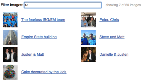
The other night I spent a few hours hacking together an upload file control for this site. As part of that work, I decided to build a little file viewer which let me see all the images I had uploaded so far.
It turned out to be a pretty neat example of jQuery and a CSS grid layout, so I split out the filtering into a new demo: Filter demo.
You just type a few keystrokes and some JavaScript goes through the list of pictures and selects the ones with titles that match what you typed. Surprisingly, the JavaScript for this with jQuery is very simple:
$("#filter").keyup(function () {
    var filter = $(this).val(), count = 0;
    $(".filtered:first li").each(function () {
        if ($(this).text().search(new RegExp(filter, "i")) < 0) {
            $(this).addClass("hidden");
        } else {
            $(this).removeClass("hidden");
            count++;
        }
    });
    $("#filter-count").text(count);
});
It uses an input field with an ID of ‘filter’, a list contained in an element with class ‘filtered’, and uses the text inside each list item for filtering. The element with an ID of ‘filter-count’ has its value set to the number of elements remaining after the filter is applied.
This should be generic enough that it’s possible to apply it to many different situations. You could also modify the matching line to use the Quicksilver scoring algorithm.
The layout is completely CSS based, and should scale up and down and reflow nicely in browsers with decent CSS support. It took me quite a while to get that right, and I had to add one non-meaningful element to the markup to fix the width of each image-caption pair.

