This is the third part in my series of articles on CSS layout fundamentals. Designed to rid the world of table-based layouts forever, you can find the other parts here:
The CSS 2.1 visual formatting model describes two primary types of boxes used for visual layouts: block and inline boxes. It is important to understand the properties of each kind of box when creating layouts with CSS.
Block box formatting
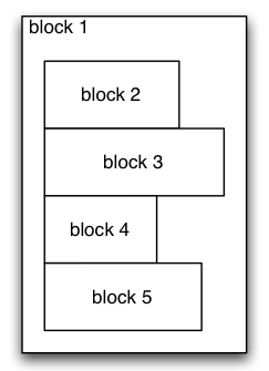
Block boxes are formatted one after the other down the page. Block boxes can contain other block boxes (or inline boxes, as we shall see). The diagram below shows one example.

Block box formatting
In this example, you could think of block #1 as the <body> tag in an HTML page. Blocks #2-5 could be paragraphs in the page.
Any element in HTML can be turned into a block box by setting the display CSS property to “block”.
Inline box formatting
Inline boxes behave very differently to block boxes. Inline boxes flow into line boxes, and are split as necessary to fit the width of their container.

Inline box formatting
In this example, the inline elements have vertical alignment of bottom or baseline so that inline #2 sticks out the top of the first line. Inline #3 is split over two lines.
Vertical margin and padding on inline elements is ignored in the visual formatting model. You can use the line-height property to adjust the height of inline elements instead.
Any element in HTML can be turned into an inline box by setting the display CSS property to “inline”.
Normal flow
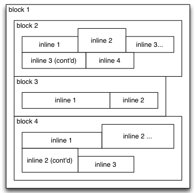
The following diagram shows the normal flow. Block boxes contain other block or inline boxes. Inline boxes flow into line boxes.

Normal flow
All blocks in this example have a position of “static”. Static is the default position value.
CSS 2 provides functionality to position boxes relative to, and outside of the normal flow. This is what we’ll cover in the next part.
