Once every few months, Atlassian holds a “FedEx day”. Developers are free to work on a project of their choosing, with the aim being to deliver something within 24 hours.
For the October FedEx day, I wrote some visualisations for wiki data. My goal was to deliver some amazing visuals which could be applied to any data set. I wanted to explore the potential of two great new graphics libraries for JavaScript: Processing.js and Raphael.
The specific data I used wasn’t really so important, but in this case I used the last 1000 comments on Atlassian’s Extranet. Surprisingly, one thousand comments on Extranet blogs takes only about 3 weeks to accrue.
For the live demos in this public example, I’ve changed the titles and usernames in the dataset from the original Extranet ones to some automatically generated usernames and titles from a news website.
Screenshots
Here are some screenshots:
Live demos
Try these in Firefox 3 or higher:
- Contributors – a tree graph visualisation linking commenters and blog post authors.
- Activity – a rippling visualisation of comment activity on the wiki. Based loosely on the Apple Arabesque screensaver.
- Comments – a falling bar-graph visualisation of comments by blogpost. Based very much on a Flash visualisation by Digg, but reimplemented in JS.
All three visualisations are done with real data in time-lapse, so you’re seeing real data on the Extranet appear as you watch (albeit with the titles and usernames changed).
The last two only work properly in Firefox 3 or higher (because it has support for text in Canvas), and they run the best in a recent Firefox nightly build. The first one, contributors, is based on Raphaël and should work with any browser. These demos really tax your computer, and will fully peg one CPU of a quad-core Mac Pro. The animation may be very slow on older machines.
What they mean
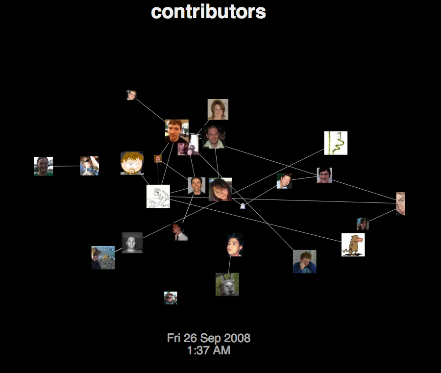
The Contributors visualisation links together blog post authors with the people who comment on their blog posts. This means that people with a lot of links either comment on many blog posts or receive a lot of comments on their own.
Each icon repels each of the others, but all icons are drawn towards the centre of the image. Links between the icons pull them together, but at close range the repulsion is usually stronger than the attraction from a link.
Each author’s icon starts to shrink unless they post another comment, in which case it jumps back to full size. Thus you can tell the age of each author’s comment from the size of his or her picture.
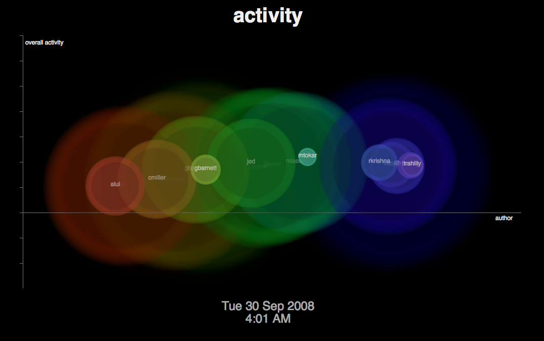
The Activity visualisation is a fairly abstract visualisation of commenting on a wiki. It displays a new ripple whenever a new comment appears. The colour and location of the ripple is dependent on the username, based on the username’s position in alphabetical order.
If there are many comments at a particular point in time, the entire graph rises up as the activity increases.
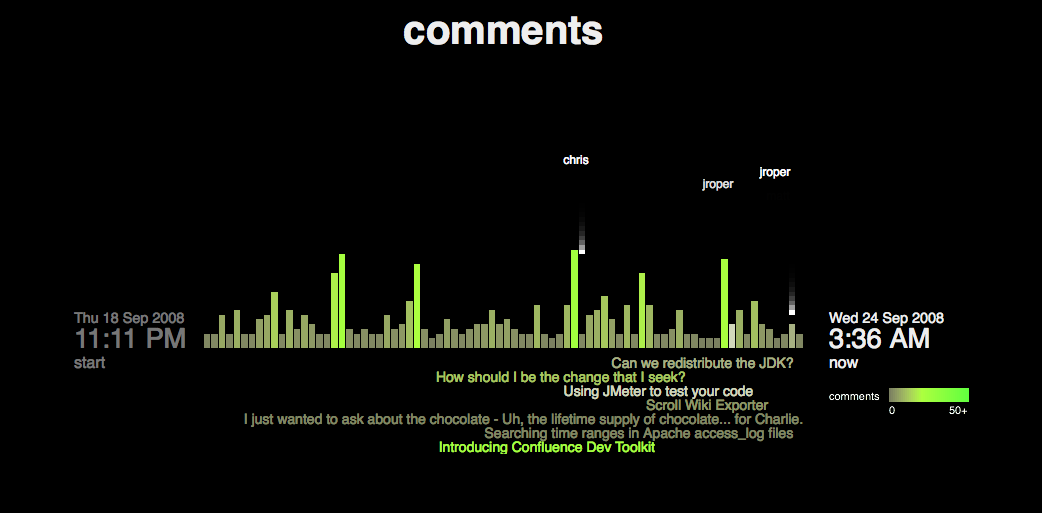
The Comments visualisation shows quite clearly where the comments on the wiki are going. Each falling block is a new comment, and it falls in the column representing the blog it was posted on. Blogs with more comments get brighter colours as time goes on. New blogs appear from the right as they are posted.
The titles at the bottom of the chart show the titles of the last seven blogs which received comments. The colours of the titles match the colours of the columns: brighter green means more comments.
This visualisation was an attempt to recreate the Digg Stack visualisation for our wiki in JavaScript. Unlike Digg, this visualisation has to use time-lapse data though, because comments on our wiki aren’t frequent enough to always be an interesting animation.
Tools and tricks
Probably the single most interesting thing I learnt was how to achieve useful colours in animations. The secret is to use HSB colour, which stands for Hue, Saturation and Brightness. Controlling these three variables separately – rather than quantities of red, green and blue in regular RGB colour – allows much more simpler animation of changing colours.
The frameworks I used gave a lot of help with getting simple things up and running. The frameworks were:
- Processing.js – a JavaScript port of the Java-based Processing graphics API and language which renders to HTML 5 canvas. This is a raster graphics framework.
- Raphaël – a JavaScript vector graphics library, which uses SVG in modern browsers and VML in Internet Explorer.
I found the raster graphics of Processing.js and Canvas particularly powerful for the fading animations used in “Activity”. This amazing effect is produced by simply drawing the black background in a semi-transparent manner with each frame rather than completely opaque. This is also the method used to leave “trails” behind the falling blocks in the “Comments” visualisation.
Where raster graphics falls down is with interactivity. I decided to use Raphaël for the “Contributors” visualisation to support drag-and-drop, and at one point I also had the pictures hyperlinking to the relevant personal spaces on our Extranet.
Processing.js had a few minor bugs that I fixed along the way. The HSB colour method didn’t work properly, and I needed to correct the font metrics functions. Hopefully I’ll be able to submit patches for these back to John soon.
All the animations are run with the standard JavaScript window.setInterval() method, but because JavaScript is single-threaded the framerate may actually vary based on the performance of the browser. You can click on any of the animations to pause them.
The overall structure of all the animations is a pipeline of components to render. The components are modelled as Objects in JavaScript, and I keep track of them in an array while the animation is running. Each object has two functions: update(), which is responsible for updating the internal state of the object to reflect its movement; and draw(), which is responsible for drawing the object onto the screen.
At each call of the timer we’ve set, we loop through all the objects twice: once to update them, and once to display them. The separate stages allow an update() function to remove its own object from the rendering queue. Some of the update methods are quite complex, updating many variables related to the component’s position, colour, velocity and interaction with other components.
In the “Comments” visualisation, the most technically complex one, there are about 7 distinct types of components. Many of the components are linked together. The top-level component is a Column, representing one vertical bar in the graph. The Column object is linked to, and manages, any Blocks that are falling down in its column, as well as the Title which appears underneath the graph and is coloured the same as the column itself. The Author component, which appears at a certain height when a block is falling, is not tied to the column and manages it own separate lifecycle.
I came up with some interesting functions to get the right colour and movement effects for some of the components. For example, the radius of each circle in the “Activity” visualisation is a quadratic function of its age in frames. As the age ranges from 0 to 100 frames, the radius accelerates from 30 up to 400 pixels.
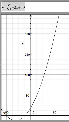
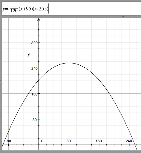
A similar quadratic formula was used for fading the author names on the Comments visualisation. In this case, I wanted the author to get slightly brighter initially before fading away. The function I came up with you can see above.
Another simple bit of math that turned out quite nicely was the overall shape of the Activity visualisation. I wanted some way to indicate overall activity on the wiki, and increasing the height of the graph seemed quite natural. What ended up working best was to plot the circles along a sine wave and increase the amplitude of the sine wave based on the activity. You’ll see this in the visualisation where the centre of the graph rises when the activity is highest.
The algorithm for the tree in the Contributors visualisation is original, but not really optimal. Perhaps I’ll come back and fix that up at some later point.
Summary
I’m really happy with the way the visualisations turned out. I think there’s some amazing visuals there. I’m keen to get them up on some big screens around Atlassian, visualising our collaboration as it happens.
