This is the fourth part in my series of articles on CSS layout fundamentals. Designed to rid the world of table-based layouts forever, you can find the other parts here:
The CSS 2.1 visual formatting model has four kinds of positioning which can be used to move boxes around in a layout: static, relative, absolute and fixed positioning. These are essential to know if you are going to prepare a CSS-based layout.
Static positioning
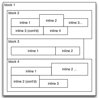
As described in the last article, normal flow is the default positioning scheme for CSS boxes. Boxes in the normal flow are said to have “static positioning”.

Normal flow, all boxes have static positioning
Occasionally in CSS layouts, you’ll need to override some other positioning value (see below) to get back to the default. If you need to do this, you can set the position property to “static”.
The following example statically positions all paragraphs elements with a class of “prose”, leaving them in the normal flow.
p.prose {
    position: static
}
In CSS terminology, any box with a position value other than “static” is said to be positioned content. The three types of positioned content – relative, absolute and fixed – were first introduced in CSS 2, and are what we’ll cover now.
Relative positioning
Relative positioning allows content to be move relative to the normal flow. It is done by setting the position property to “relative”, and optionally defining offsets with the top, right, bottom and left properties.
With relative positioning, neighbouring content in the page remains as if the relatively positioned content was actually positioned statically. Relative positioning is not used very often in CSS-based layouts, as its functionality isn’t needed for most common page layouts.
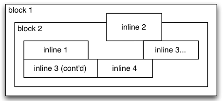
In the following simplified example, the second inline element has been relatively positioned. Note how the top and left property values are used as offsets from the box’s normal position, and the neighbouring content is laid out as if the box was not moved at all.
inline#2 {
    position: relative;
    left: 1em;
    top: -1em;
}

Relative positioning example
Absolute positioning
Absolute positioning positions content relative to the nearest positioned ancestor box (recall that positioned content is any box with a position value other than “static”), outside of the normal flow.
By outside the normal flow, I mean that neighbouring content is rendered as if the absolutely positioned box did not exist. If no positioned ancestor box exists, the absolutely positioned box is positioned relative to the canvas boundaries.
The top, right, bottom and left properties indicate how far away the element should be from the corresponding boundary of the containing box. The CSS specification says how positioned elements should behave if you have both top and bottom or both left and right defined (the box is stretched to the appropriate dimensions). However, Internet Explorer doesn’t conform to the specification in this matter, so you probably want to avoid using it.
With the following example CSS, paragraphs with a class of “date” would be positioned at the top-right of any container which is positioned, or at the top-right of the page if there is no positioned container.
p.date {
    position: absolute;
    top: 0;
    right: 0;
}
We’ll see a visual example of absolute positioning in the demonstration layouts later in the series.
Fixed positioning
Like absolute positioning, boxes with position: fixed are rendered outside the normal flow. Unlike absolute positioning though, fixed content is positioned relative to the viewport – the browser window, for most users.
This means that when you scroll down the page, the fixed content stays in the same spot on your screen, regardless of what else is on the page. Fixed content will typically overlap any other content on the page.
Fixed positioning doesn’t work in Internet Explorer 6, and therefore isn’t very useful for most CSS layouts which need to work in multiple browsers. However, it is quite surprising to see when you notice it on a web page.
One example of a fixed layout is on Sam Ruby’s blog, where the navigation bar on the right uses the following CSS. When you scroll down the page, the navigation bar stays at a fixed location in your viewport.
aside {
    position: fixed;
    right: 1em;
    top: 5em;
}
There’s a lot of flexibility provided by these three new positioning mechanisms introduced in CSS 2. The next part will describe the final tool in the CSS layout toolbox: floats.
